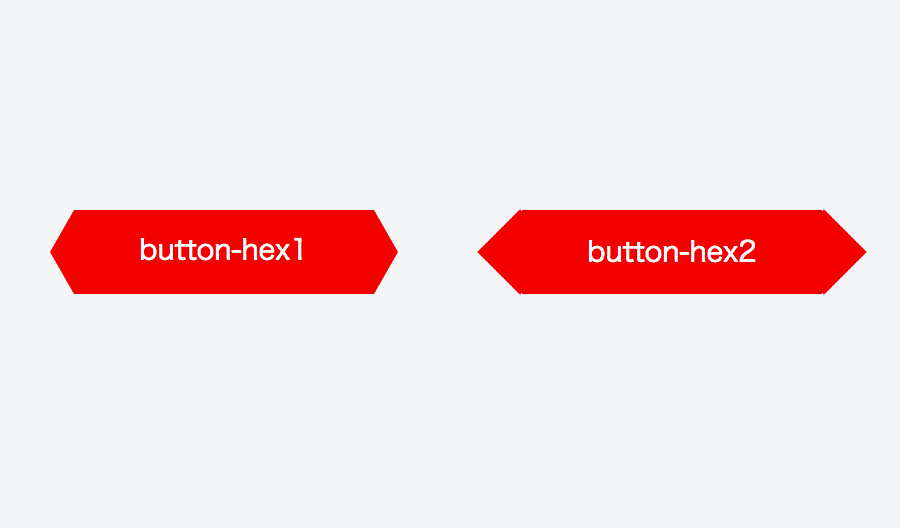
画像のような六角形のボタンを二つの異なるCSS実装で作ってみました。
1. :before, :after疑似要素にborderで描画する方法
:before, :after疑似要素にborderプロパティで三角形を作り、長方形にくっつける。
- メリット: 自由に六角形の角度を変えられる
- デメリット: (ホバー時など)白抜きできない
コード
index.html
button-hex1
style.css
.button-hex {
    font-size: 14px;
    line-height: 40px;
    position: relative;
    display: inline-block;
    width: 150px;
    height: 42px;
    transition: all .1s ease-in-out;
    text-align: center;
    text-decoration: none;
    color: #fff;
    background-color: red;
}
.button-hex:before,
.button-hex:after {
    position: absolute;
    top: 0;
    width: 0;
    height: 0;
    content: '';
    border: 21px solid transparent;
    border-right: 12px solid transparent;
    border-left: 12px solid transparent;
}
.button-hex:before {
    right: 100%;
    border-right-color: red;
}
.button-hex:after {
    left: 100%;
    border-left-color: red;
}
.button-hex:hover {
    opacity: .7;
}
2. :before, :after疑似要素にbackground-colorで描画する方法
:before, :after疑似要素にbackground-colorプロパティで正方形を作り、45°回転させて長方形にくっつける。
- メリット: (ホバー時など)白抜きができる
- デメリット: 角度は固定、z-indexの調整が必要。
コード
index.html
button-hex2
style.css
.button-hex2 {
    font-size: 14px;
    line-height: 38px;
    position: relative;
    z-index: 1;
    display: block;
    width: 150px;
    height: 38px;
    transition: .1s ease-in-out;
    text-align: center;
    text-decoration: none;
    color: #fff;
    border-top: 2px solid red;
    border-bottom: 2px solid red;
    background-color: red;
}
.button-hex2:before,
.button-hex2:after {
    position: absolute;
    top: 4px;
    width: 28px;
    height: 28px;
    content: '';
    transition: .1s ease-in-out;
    transform: perspective(12px);
    transform: rotate(45deg);
    border: 0;
    background-color: red;
}
.button-hex2:before {
    left: -16px;
    border-bottom: 2px solid red;
    border-left: 2px solid red;
}
.button-hex2:after {
    right: -16px;
    border-top: 2px solid red;
    border-right: 2px solid red;
}
.button-hex2:hover:before,
.button-hex2:hover:after {
    background-color: #fff;
}
.button-hex2:hover {
    color: red;
    background-color: #fff;
}
サンプル
https://jsfiddle.net/ktbcoyxf/