昨日書いたCSSで版ズレエフェクト画像編に続き、テキストで版ズレを作ってみたらなかなかエモい感じになりました。
See the Pen
CSS Off-registration Text Effect by Hibiki Kudo (@h_kudo)
on CodePen.
コード
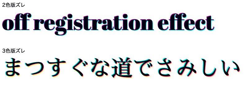
2色版ズレ
html
<link href="https://fonts.googleapis.com/css?family=Abril+Fatface|Sawarabi+Mincho&display=swap" rel="stylesheet">
<div class="off-registration">
  off registration effect
</div>
scss
.off-registration {
  font-family: "Abril Fatface", "Sawarabi Mincho", cursive;
  font-size: 70px;
  color: rgba(0, 0, 0, 0.9);
  position: relative;
  line-height: 1.2;
  margin-bottom: 40px;
  @media screen and (max-width: 480px) {
    font-size: 60px;
  }
  &:before,
  &:after {
    top: 0;
    position: absolute;
    display: block;
    content: "off registration effect";
    mix-blend-mode: color-burn;
  }
  &:before {
    color: cyan;
    transform: translate(1px, 1px) rotate(0.1deg);
  }
  &:after {
    color: magenta;
    transform: translate(-1px, -1px);
  }
}
3色版ズレ
html
<link href="https://fonts.googleapis.com/css?family=Abril+Fatface|Sawarabi+Mincho&display=swap" rel="stylesheet">
3色版ズレ
<div class="off-registration-jp">
  <span>まつすぐな道でさみしい</span>
</div>
scss
.off-registration-jp {
  font-family: "Abril Fatface", "Sawarabi Mincho", cursive;
  font-size: 70px;
  color: rgba(0, 0, 0, 0.9);
  position: relative;
  line-height: 1.2;
  @media screen and (max-width: 480px) {
    font-size: 60px;
  }
  &:before,
  &:after {
    top: 0;
    position: absolute;
    display: block;
    content: "まつすぐな道でさみしい";
    mix-blend-mode: color-burn;
  }
  &:before {
    color: magenta;
    transform: translate(1px, 1px) rotate(0.1deg);
  }
  &:after {
    color: cyan;
    transform: translate(-2px, -1px) rotate(-0.2deg);
  }
  span {
    &:before {
      top: 0;
      position: absolute;
      display: block;
      content: "まつすぐな道でさみしい";
      mix-blend-mode: color-burn;
      color: rgba(250, 240, 0, 0.7);
      transform: translate(2px, 3px);
    }
  }
}
基本は画像編と一緒です。こちらの方がより簡単ですね。
ポイントはシアン(Cyan)、マゼンタ(Magenta)、イエロー(Yellow)のうち2色を使って、CMYK印刷の雰囲気を出すこと。
3色選ぶと輪郭の荒れが気になりましたが、イエローを最前面に持ってくると綺麗な表示になりました。
Google Fontsでいい感じのフォントを選んで遊んでみてください!