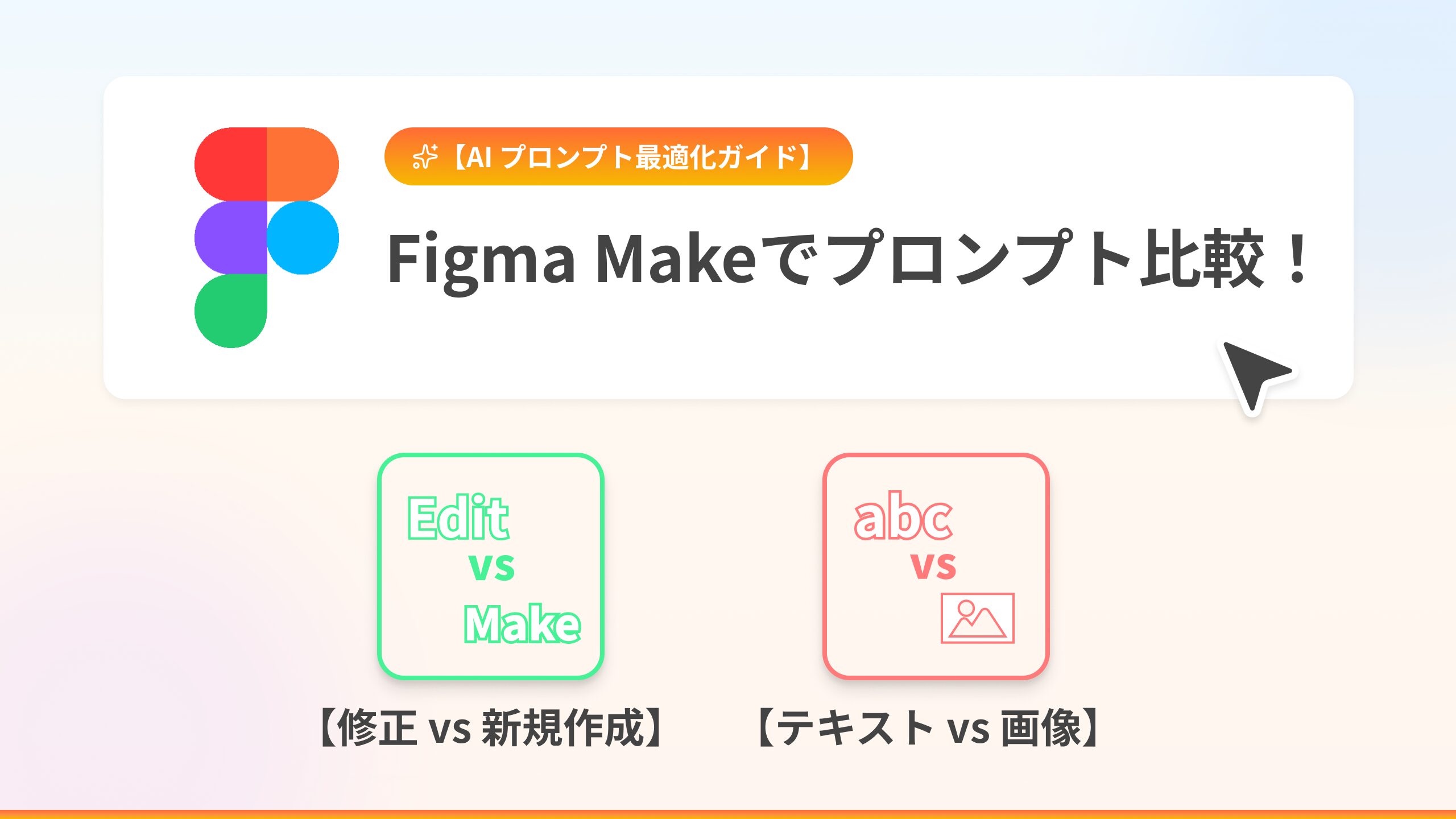
こんにちは!デザイン事業部の八木田です。
Figmaに追加された生成AI機能、「Figma Make」を使って、架空のWebサイトを作成しながら
どのプロンプトならデザイン性の高いWebサイトを生成してくれるかを実験しました(Figma Learn「ベストプラクティス」)。
本記事では、ブラッシュアップ時に「生成されたものに追加修正で生成する場合 (Edit)」と「新規ファイルで生成する場合 (Make)」、あるいは「テキストのみで指示する場合」「画像データを参照させる場合」で生成されるデザインにどのような差が出るのかを検証しています。
本記事は2025年12月現在の情報です。
※Figma Makeのアップデートなどにより、生成物の質が変化する可能性が高いです。
検証の前提
今回は以下の3つのパターンで検証を行いました。
1. ブラッシュアップ時にstyleをテキストで指示(修正 / 新規作成)
2. ブラッシュアップ時にstyleを画像で指示(修正 / 新規作成)
3. ブラッシュアップ時にstyleをFigmaデータで指示(修正 / 新規作成)
4. 【修正 vs 新規作成】比較の検証結果
5. 【テキスト vs 画像データ】比較の検証結果
1. テキストでstyleを指示(修正 / 新規作成)
テキストのみでstyleを指示したプロンプトで作成しました。
生成されたデザインをさらにブラッシュアップするときの想定で、「既存ファイルを修正(Edit)」するか、「プロンプトを調整して新規作成(Make)」するかパターンで作成しました。
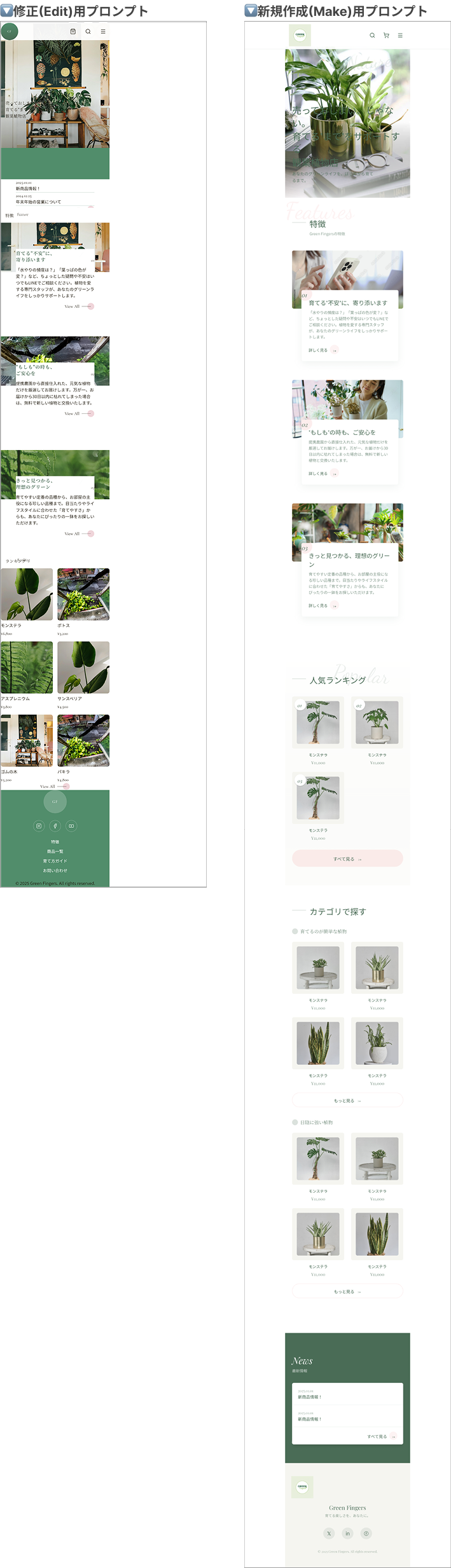
▼ブラッシュアップしたいFigma Makeファイルの元デザイン
プロンプトにstyleの指示を含めずに生成したデザインです。
styleが反映されず、cssが崩れたような見づらいデザインとなっています。
プロンプト内容
プロンプトのキーワード:Luxury feel (高級感)、Ample whitespace (十分な余白)、Serif font (セリフ体)
修正(Edit)用プロンプト:
Mobile website design for a premium online plant shop named "Green Fingers". Target audience is 20-30s. The style should be sophisticated, minimalist, and high-end using ample whitespace and earthy tones (sage green, beige).

Layout structure:
- Header: Minimal sticky header with Hamburger menu icon, Logo (center), and Cart icon.
- Hero Section: Full-screen high-quality background image of a stylish living room with plants. Overlay elegant serif text "Premium Plant Collection" with a "Shop Now" pill-shaped button.
- Features: 3 icons horizontally aligned with short text describing "Support", "Quality", "Variety". Clean iconography.
- Categories: A horizontal scrollable list (carousel) of cards. Each card has a plant image and category name (e.g., "Easy Care", "Shade Lovers").
- Popular Items: A 2-column grid layout showing product cards. Each card features a large product image, minimal title, and price. Rounded corners.
- Reviews: A slider section showing customer testimonials with circular profile pictures.
- Footer: Dark background with white text, social media icons, and simple links.
Design System: Use a Serif font for headings to create a luxury feel, and Sans-serif for body text.
新規作成(Make)用プロンプト:Layout structure:より前の文章を以下に変更
Mobile website design for "Green Fingers," an ultra-luxury online plant boutique. The style must be cinematic, high-end fashion editorial, with massive negative space and bold typography, similar to a luxury design portfolio.
Design Principles:
- Spacing: Extremely airy layout. Double the usual amount of whitespace between all sections and elements to create a sense of luxury and calm.
- Typography: Use huge, dramatic Serif fonts for primary headings (like H1) to create impact. Use clean, sophisticated Sans-serif fonts for body text. High contrast in size and weight.
- Color & Mood: Deep, rich earthy background tones (e.g., dark charcoal, forest green, or deep taupe) to make the plant images pop. Luxurious feel.
生成結果
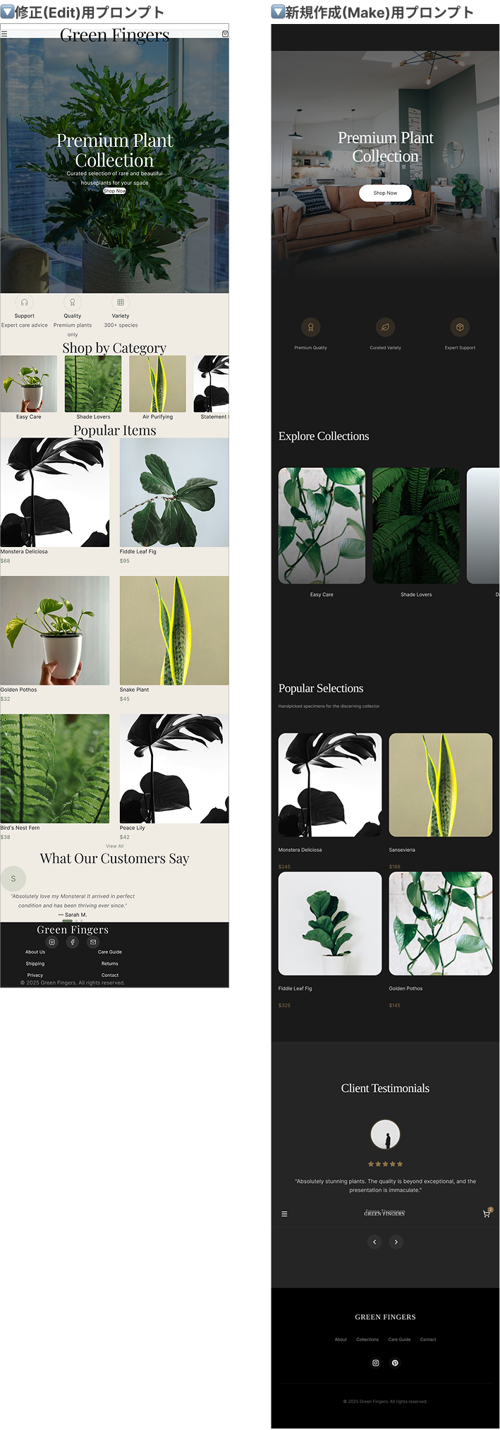
(左: 修正(Edit)用プロンプト、右: 新規作成(Make)用プロンプト)
検証結果
修正用と新規作成用でほぼ同じプロンプトを使用したのにも関わらず、生成されたデザインは全く違うものになっています。
新規作成(Make)したものの方が、余白などstyleが整ったWebサイトとなりました。
修正(Edit)したものは、元のデザインのstyleが残っているように感じます。
2. PNG画像でstyleを指示(修正 / 新規作成)
次に、言葉では説明しにくい「雰囲気」や「複雑なレイアウト」を伝えるため、理想とするデザインのPNG画像をFigma Makeに添付して指示を出しました。
修正(Edit)用の元のデザインは、「1. テキストでstyleを指示」の修正(Edit)で生成されたものを使用しています。
プロンプト内容
テキストでの指示に加え、明確に「添付したモバイル版Webサイトの画像のデザインを参考に」という文言を追加しました。
▼添付した画像(今回は個人課題として制作したWebサイトデザイン案を使用しました。)

プロンプトのキーワード:Break the Grid(グリッドを崩す)、Overlap(重ねる)、Asymmetrical(非対称)、Soft Editorial(柔らかい編集デザイン)
修正(Edit)用プロンプト:
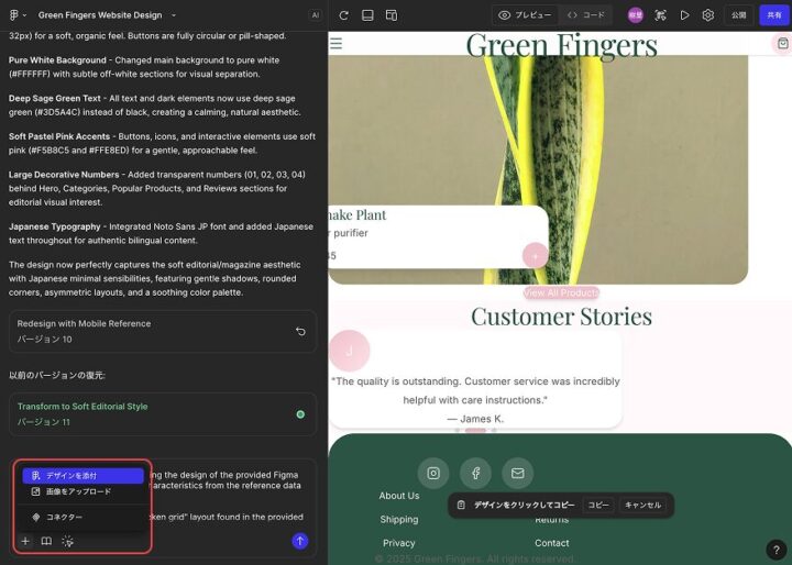
Redesign the current selection, referencing the design of the attached mobile website image. Apply the specific visual style and layout rules from the image to the selected frames.
Specific Modifications to Apply:
1. Break the Grid: Shift images and text blocks so they are asymmetrical. Allow text boxes to partially overlap their corresponding images (offset layout), as seen in the reference image.
2. Add Overlays & Softness: Add a white background to overlapping text boxes with a soft shadow for readability. Change all sharp corners to soft rounded corners. Change solid rectangular buttons to small circles or pill shapes.
3. Color Adjustment: Change the main background to pure white. Convert all black text/backgrounds to Deep Sage Green. Change accent elements (buttons/icons) to Soft Pastel Pink.
4. Decorative Elements: Add large, transparent numbers (01, 02) behind sections like "Features" or "Steps" to add visual interest, mimicking the attached image.
新規作成(Make)用プロンプト:Specific Modifications to Apply:より前の文章を以下に変更
Create a mobile landing page for "Green Fingers", referencing the design of the attached mobile website image. Incorporate the visual style, color palette, and layout structure of the image into the new design.
Visual Style to Mimic:
- Layout: Use the "broken grid" and asymmetrical layout found in the attached image. Allow images and text cards to slightly overlap to create a soft, editorial look.
- Color Palette: Strictly follow the image's scheme: Pure White background, Deep Sage Green for text/headings, and Soft Pastel Pink for accents and buttons.
- Typography & Decor: Use an elegant Serif font for headings. Add large, transparent background numbers (01, 02) behind sections, as seen in the reference.
生成結果
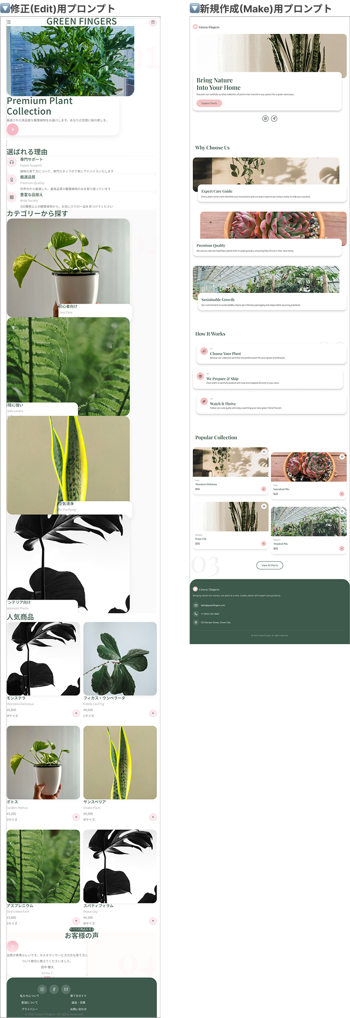
(左: 修正(Edit)用プロンプト、右: 新規作成(Make)用プロンプト)
検証結果
テキストのみのプロンプトを与えていた「1. テキストでstyleを指示」よりも、添付画像の色味やコンセプトに沿った統一感のあるデザインになりました。
添付画像のWebサイトが日本語であることから、修正(Edit)で生成したデザインのみ日本語のWebサイトになりました。
今回も、新規作成(Make)した方がstyleが整ったデザインになりました。
3. Figmaデータでstyleを指示(修正 / 新規作成)
最後に、Figma上のデザインデータ(フレームやレイヤー)を選択し、それを参照元として生成を行いました。
プロンプト内容
プロンプトの最初に、「提供されたFigmaデータのデザインを参考にする」と明記し参照元の特徴(色、形、あしらい)を言語化してAIに認識させました。
Figmaデータには、「2. PNG画像でstyleを指示」でプロンプトに添付したPNG画像と同じデザインのFigmaデータを用いています。
プロンプトにFigmaデータを添付するには、使用するデザインのフレームURLをコピーし、Figma Makeのプロンプト入力欄の+のデザインを添付からURLを入力するとを参照させることが可能です。
プロンプトのキーワード:Broken grid (グリッドを崩した配置)、Overlap / Offset (要素同士を少し重ねる)、Airy (風通しの良い)
修正(Edit)用プロンプト:
Redesign this selection referencing the design of the provided Figma data. Apply the specific visual characteristics from the reference data to the current selection.
Visual Characteristics to Apply:
1. Layout Structure: Adopt the "broken grid" layout found in the provided data. Arrange images and text asymmetrically, allowing text boxes to partially overlap the images (offset layout).
2. Color Palette: Strictly follow the provided data's scheme: Pure White background, Deep Sage Green (#4A6C56) for text/headings, and Soft Pastel Pink (#F4C2C2) for accents.
3. UI Elements: Change buttons to pill shapes or small circles as seen in the reference. Use soft rounded corners for all cards and images.
4. Typography: Use the same font style as the provided data (Elegant Serif for headings, clean Sans-serif for body).
5. Decorative Details: Include the large background numbers (01, 02) and script text accents if present in the data.
6. Spacing: Replicate the airy vertical spacing (whitespace) observed in the provided design.
新規作成(Make)用プロンプト:
Based on the provided Figma data, create a mobile landing page for "Green Fingers" with a "Soft Editorial / Japanese Lifestyle Magazine" aesthetic.
Visual Style & Layout:
- Concept: Organic, airy, and delicate. Use the text content from the input data.
- Layout: Use a "broken grid" layout. Images and text cards should slightly overlap (offset layout) to create depth.
- Colors: Pure White background (#FFFFFF), Sage Green (#4A6C56) for headings, and Soft Pastel Pink (#F4C2C2) for accents/buttons.
- Typography: Elegant Serif for headings (e.g., Playfair Display). Decorative Script font for background accents. Clean Sans-serif for body.
Key Instructions:
- Use the input text: Ensure the text hierarchy matches the provided data.
- Sections: Hero, Steps (How to), Products, and News.
生成結果
(左: 修正(Edit)用プロンプト、右: 新規作成(Make)用プロンプト)
検証結果
修正(Edit)した方も、新規作成(Make)した方も添付したFigmaデータとかなり近いものが再現されました。
特に、新規作成(Make)した方は添付したFigmaデータとほぼ同じデザインになりました。
しかし、どちらも添付したFigmaデータの幅で生成されてしまい、レスポンシブ対応していない不自然なデザインになってしまいました。
【修正 vs 新規作成】比較の検証結果
Figma Makeを用いて生成されたものをブラッシュアップする際、「既存ファイルを修正(Edit)」するか、「プロンプトを調整して新規作成(Make)」するかを比較しました。
結果、大幅なブラッシュアップを行いたいときは「新規作成した方がプロンプトが反映され、デザイン精度が高い」と感じました。
修正(Edit)を行うと、どうしても元のデザインが残ってしまい余白や配置のstyleが崩れがちです。
修正と新規作成で以下の特徴があります。
修正: テキストや画像の内容を維持したい場合に有効。大胆なレイアウト変更(グリッドを崩すなど)は苦手な傾向がある。
新規作成: 参考画像や詳細なスタイル定義を与えてゼロから作った方が、結果として理想に近い「洗練されたデザイン」に早く到達可能。
【テキスト vs 画像データ】比較の検証結果
今回の検証で、「テキストのみ」「PNG画像データ添付」「Figmaデータ添付」のプロンプトを検証しました。
結果、理想とする配色やコンセプトがある場合は画像orFigmaデータを参照するよう指示した方が再現性が上がるとわかりました。
しかし、プロンプトによっては与えた参照データのデザインをほぼそのまま生成してしまいます。
参照データの「どこ」や「なに」を参照して欲しいのかをプロンプトに含める必要があります。
Figma Learn「ベストプラクティス」では、
添付されたデザインをショッピングカートの例として利用してください。
のように一部の機能のデザインにのみデータを参照させています。
Figma Makeプロンプトのポイント
今回の検証から、Figma Makeを使いこなすための以下の法則が見えてきました。
1. プロンプトには「機能」より「style」を含める
「カートボタンを置いて」「キャンペーンへの導線を作って」といった機能要件を羅列すると、AIはそれを全て詰め込もうとして情報過多なデザインになりがちです。
機能は最低限にし、「角丸のカードUI」「要素を重ねる(Overlay)」「たっぷりの余白(Ample whitespace)」など、具体的なデザインやスタイルの特徴を言葉で説明する方が、意図したビジュアルが出やすくなります。
2. デザインの大幅な刷新は「新規ファイル」で
一度生成されたデザインに対して「Edit(修正)」機能でスタイルを大きく変えようとすると、元のレイアウト構造に引きずられてしまい、うまくいかないことが多々ありました。
デザインの方向性をガラッと変えたい場合や、ブラッシュアップに行き詰まった場合は、新規Figma Makeファイルを作成し、プロンプトを調整してまっさらな状態で生成し直す方が、結果として近道になります。
3. 雰囲気は「テキスト」より「参照データ」で伝える
「雑誌のような」「エモーショナルな」といった抽象的なコンセプトや雰囲気は、言葉だけではAIに伝わりにくい領域です。
これらはテキストで長々と説明するよりも、理想とする画像データ(PNG/JPG)やFigmaデータを参照させる方が、配色や空気感を高い精度で再現してくれます。
4. サイトのタイプによる使い分け
作りたいWebサイトの性質によって、プロンプトのアプローチを使い分けるのがおすすめです。
* テキストプロンプトのみでOKな場合:
ポートフォリオや一般的なコーポレートサイトなど、「よくある標準的な構成」のWebサイト。
Figma AIが学習しているパターンが多いため、言葉だけでも十分整ったデザインが生成されます。
* 画像・データ参照が必要な場合:
ブランド独自の世界観があるサイトや、複雑なレイアウトのサイト。
「標準的なテンプレートから逸脱したい」場合は、テキストだけでなく視覚的なリファレンスを与えることが必須となります。
参考サイト
Figma Learnベストプラクティス(2025/12/24閲覧)
NODERIUM公式サイト(2025/12/24閲覧)
※記事中に掲載したWebサイトデザイン案の中の画像はNODERIUM公式サイトのものを使用させていただきました。
 簡単30秒
簡単30秒