はじめに
この記事では Lookerのダッシュボードを学習していく記事です。主な内容としては実践したときのメモを中心に書きます。(忘れやすいことなど)
誤りなどがあれば書き直していく予定です。なお、内容につきましては2023年8月29日時点の調査内容で記載しております。あらかじめご了承ください。
LookerやLookMLについて前提知識をおさらいしたい方につきましてはiret.mediaで解説していますので一度目を通していただけますと幸いです。
Lookerのダッシュボードを知る前にそもそもLookMLとは
LookMLとはそもそもどんなものだったでしょうかここで少しだけおさらいしましょう。
繰り返しになりますが、過去の記事を引用で簡単におさらいします。
つまり、LookMLはLookerのためのデータモデリングとクエリ言語です。SQLを内包したデータ定義(スキーマ)を記述する言語とも言えます。※必ずしも内包する必要はありません。また、複雑なSQLを書くことなく、DRY原則に基づいて複雑なクエリを作成できます。
また、LookMLはLookMLプロジェクト内で管理されます。
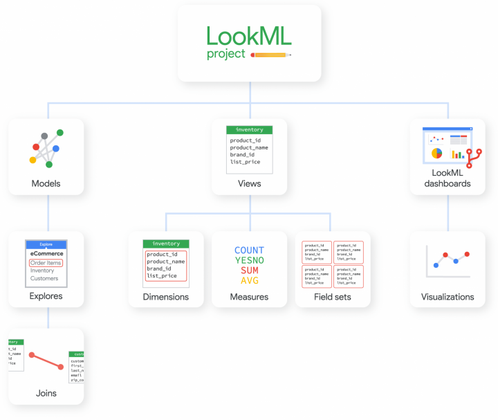
LookMLプロジェクトの構造
出典:https://cloud.google.com/looker/docs/what-is-lookml?hl=ja
別の呼び方をするとLookMLプロジェクトに所属する概念は言語で表現できます。その際に利用する言語がLookMLです。
つまり
データソースや可視化を保存する=データソースや可視化をLookMLで定義して表現する
ということになります。
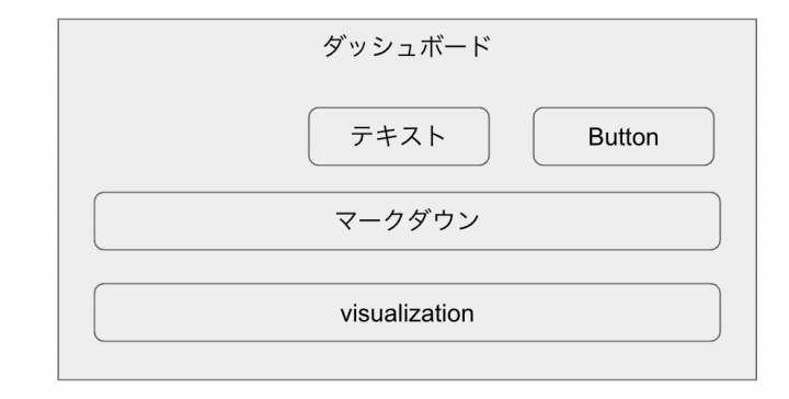
Lookerのダッシュボードとは
Lookerのダッシュボードは作成した可視化をタイルという単位で配置することで一つの画面を作成できる機能です。また、複数の可視化やテキスト、マークダウン、ボタンを配置できます。
LookerのダッシュボードもLookMLプロジェクトで管理できます。
補足:そもそもダッシュボードって何?
Lookerの話を抜きにし、BIツールという範囲においてダッシュボードは何かを述べると複数の重要な可視化や指標を一覧にして一つの画面にしたものがダッシュボードです。
LookMLプロジェクトとはどういう関係にあるのか
LookMLプロジェクトの構造では一つのLookMLダッシュボードに一つのvisualizationが線で結ばれていますが、実際には一つのダッシュボードに複数のvisualizationが内包されているイメージです。
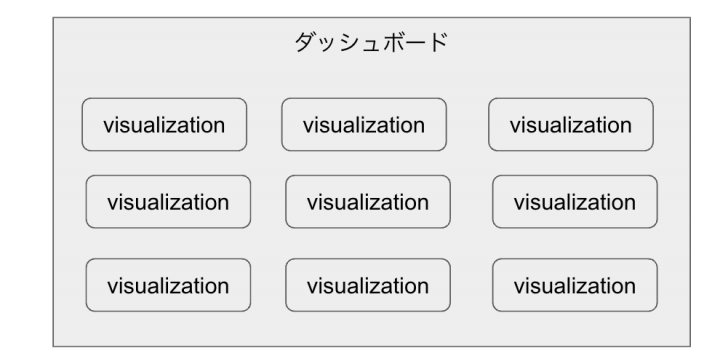
LookMLプロジェクトにおいてvisualizationはLookMLで表現できます。そして、ダッシュボードは複数のvisualizationで表現されるため、つまりはLookerのダッシュボードはLookMLで管理できます。
Lookerのダッシュボードを定義したLookMLを見てみる
実際にダッシュボードのLookMLを出力すると下記のようになります。
- dashboard: sample
  title: sample
  layout: newspaper
  preferred_viewer: dashboards-next
  description: ''
  preferred_slug: {preferred_slug}
  elements:
  - name: ''
    type: text
    title_text: ''
    subtitle_text: ''
    body_text: '[{"type":"h1","children":[{"text":"あいうえお"}],"align":"center"}]'
    rich_content_json: '{"format":"slate"}'
    row: 13
    col: 0
    width: 24
    height: 2
  - name: タイトル
    type: text
    title_text: タイトル
    subtitle_text: サブタイトル
    body_text: |-
      # 見出し1
      ## 見出し2
    row: 15
    col: 0
    width: 24
    height: 3
  - type: button
    name: button_847
    rich_content_json: '{"text":"小さいボタン、中央寄せ","description":"","newTab":true,"alignment":"center","size":"small","style":"FILLED","color":"#1A73E8"}'
    row: 8
    col: 0
    width: 24
    height: 1
  - type: button
    name: button_848
    rich_content_json: '{"text":"小さいボタン、右寄せ","description":"","newTab":true,"alignment":"right","size":"small","style":"FILLED","color":"#1A73E8"}'
    row: 7
    col: 0
    width: 24
    height: 1
  - title: 件数
    name: 件数
    model: {model}
    explore: {View}
    type: single_value
    fields: [{View}.count]
    filters:
      {View}.date_filter: 2023/08/21 00:00 to 2023/08/22 00:00
    sorts: [{View}.count]
    limit: 500
    column_limit: 50
    custom_color_enabled: true
    show_single_value_title: true
    show_comparison: false
    comparison_type: value
    comparison_reverse_colors: false
    show_comparison_label: true
    enable_conditional_formatting: false
    conditional_formatting_include_totals: false
    conditional_formatting_include_nulls: false
    defaults_version: 1
    row: 10
    col: 0
    width: 24
    height: 3
  - type: button
    name: button_850
    rich_content_json: '{"text":"小さいボタン、左寄せ","description":"","newTab":true,"alignment":"left","size":"small","style":"FILLED","color":"#1A73E8"}'
    row: 9
    col: 0
    width: 24
    height: 1
  - type: button
    name: button_851
    rich_content_json: '{"text":"中サイズ、左寄せ","description":"","newTab":true,"alignment":"left","size":"medium","style":"FILLED","color":"#1A73E8"}'
    row: 6
    col: 0
    width: 24
    height: 1
  - type: button
    name: button_852
    rich_content_json: '{"text":"中サイズ、右寄せ","description":"","newTab":true,"alignment":"right","size":"medium","style":"FILLED","color":"#1A73E8"}'
    row: 4
    col: 0
    width: 24
    height: 1
  - type: button
    name: button_853
    rich_content_json: '{"text":"中サイズ、中央寄せ","description":"","newTab":true,"alignment":"center","size":"medium","style":"FILLED","color":"#1A73E8"}'
    row: 5
    col: 0
    width: 24
    height: 1
  - type: button
    name: button_854
    rich_content_json: '{"text":"大きいボタン、左寄せ","description":"","newTab":true,"alignment":"left","size":"large","style":"FILLED","color":"#1A73E8"}'
    row: 3
    col: 0
    width: 24
    height: 1
  - type: button
    name: button_855
    rich_content_json: '{"text":"大きいボタン、中央寄せ","description":"","newTab":true,"alignment":"center","size":"large","style":"FILLED","color":"#1A73E8"}'
    row: 2
    col: 0
    width: 24
    height: 1
  - type: button
    name: button_856
    rich_content_json: '{"text":"大きいボタン、右寄せ","description":"","newTab":true,"alignment":"right","size":"large","style":"FILLED","color":"#1A73E8","href":""}'
    row: 1
    col: 0
    width: 24
    height: 1
  - type: button
    name: button_857
    rich_content_json: '{"text":"別のウィンドウで開く","description":"","newTab":true,"alignment":"center","size":"large","style":"TRANSPARENT","color":"#1A73E8"}'
    row: 0
    col: 0
    width: 24
    height: 1
一見して何がどうなっているかはわからないですよね。
一つ一つ見ていきましょう。
LookMLを細かく読む
まずは、ダッシュボードの定義を見ていきましょう。ダッシュボードにはいくつか設定値があります。今回注目すべきところとしてはelementsというところです。
- dashboard: sample
  title: sample
  layout: newspaper
  preferred_viewer: dashboards-next
  description: ''
  preferred_slug: {preferred_slug}
  elements:
ダッシュボードのelementsより下に可視化の定義を書きます。今回の場合は複数の可視化やテキスト、マークダウン、ボタンが可視化として定義されています。
可視化を定義するLookML
おさらいですが、複数の可視化やテキスト、マークダウン、ボタンを配置できます。
下記のLookMLは見出しレベル1であいうえおと書いた場合の可視化です。
- name: ''
  type: text
  title_text: ''
  subtitle_text: ''
  body_text: '[{"type":"h1","children":[{"text":"あいうえお"}],"align":"center"}]'
  rich_content_json: '{"format":"slate"}'
  row: 13
  col: 0
  width: 24
  height: 2
上記のLookMLはダッシュボードの一つのエレメントとして定義され、ダッシュボードのタイルとしてレンダリングされます。
「そういえば、Lookというダッシュボード上に配置できるパーツもありましたよね?」とそう思われるかもしれません。実はLookも上記のようなLookMLで定義されます。
単一値のLookは下記のように定義されます。
- title: 件数
  name: 件数
  model: {model}
  explore: {View}
  type: single_value
  fields: [{View}.count]
  filters:
    {View}.date_filter: 2023/08/21 00:00 to 2023/08/22 00:00
  sorts: [{View}.count]
  limit: 500
  column_limit: 50
  custom_color_enabled: true
  show_single_value_title: true
  show_comparison: false
  comparison_type: value
  comparison_reverse_colors: false
  show_comparison_label: true
  enable_conditional_formatting: false
  conditional_formatting_include_totals: false
  conditional_formatting_include_nulls: false
  defaults_version: 1
  row: 10
  col: 0
  width: 24
  height: 3
「LookのLookMLはどのように定義すれば良いか」と迷われた場合は「Lookはダッシュボードの一部もしくは本体として定義される」と覚えておくと良いでしょう。
まとめ
今回は基本のみをおさらいしましたが、実際にはクロスフィルタを含むフィルタ機能やダッシュボード用の各種タイル(テキスト、マークダウン、ボタンなど)があります。もっと応用的な使い方をしたい場合は今回の内容では足りませんので機会があったら解説したいと思います。Lookerのダッシュボードに関する解説は以上です。以下、本記事のまとめです。
- LookerのダッシュボードはLookMLプロジェクトで管理する
- Lookerのダッシュボードはコードレベルで管理できる
- ビューなどから作成したLookはダッシュボードのタイルとして定義できる
- ダッシュボードのelementsの配下に順番に定義していく
- ダッシュボードには専用のタイルとしてテキスト、マークダウン、ボタンを配置できる

 簡単30秒
簡単30秒